Categories
maps science communication

En route to AGU

My recent blog silence has been partially because I’ve been getting ready to present research at the 2103 American Geophysical Union (AGU) Fall Meeting. I’ve been working on a comparative analysis of online interactive sea level rise viewers, which are used to help people visualize the potential effects of sea level rise on coastlines. I’ll be presenting some of the results at the conference as a poster presentation on Monday afternoon, titled “Building Stories about Sea Level Rise through Interactive Visualizations” (Paper Number PA13A-1762, for anyone who sees this and is interested in talking to me :))

Here’s the introduction:

Sea level rise (SLR) is an aspect of global climate change that can be communicated effectively using visuals. We focus on online interactive SLR viewers, which: visualize SLR or coastal areas that could potentially be affected by SLR; allow users to interact with the visualization by scrolling, zooming, and other features related to view selection; use a map as a base layer; and are located online. SLR viewers can visualize a range of SLR scenarios to communicate about possible coastal impacts. They let us represent the effects and risks of SLR for coastal planning and community outreach. As users interact with SLR viewers, they build personalized narratives about SLR’s effects and risks. By helping audiences visualize the potential impacts of SLR in locations that are personally important to them, we can motivate them to try to understand SLR and support efforts to mitigate or respond to it.

And here’s a pdf version of it:  Stephens AGU poster. Please note the screenshots in the poster are copyrighted by their respective creators. I’ve also collaborated on two other presentations related to science communication in general:

D. E. DeLorme, S. C. Hagen, & S. H. Stephens, 2013. “Strategies for Sharing Scientific Research on Sea Level Rise: Suggestions from Stakeholder Focus Groups.”

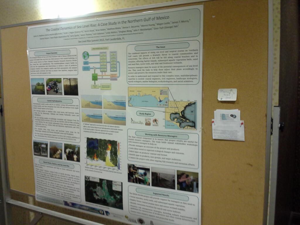
S. C. Hagen, S. H. Stephens, D. E. DeLorme, D. Ruple, & L. Graham, 2013. “Increasing Public Access to Scientific Research through Stakeholder Involvement: Ecological Effects of Sea Level Rise in the Northern Gulf of Mexico.”

I’ve never been to an AGU meeting before, and from what I hear, it can be an overwhelming experience (>20,000 people attending!). But I’m armed with a list of interesting presentations that I want to see and am meeting up with some folks there, so it should be interesting. Of course, I’m also hoping to get some birding in while I’m there- at least see the famous San Francisco parrots!

Categories
environment meetings science communication

At the Sea Level Rise Summit

We’re currently halfway through the 2013 Sea Level Rise Summit in Fort Lauderdale. I have a poster up at the meeting about the coastal dynamics of sea level rise project (or Ecological Effects of Sea Level Rise in the Northern Gulf of Mexico/EESLR-NGOM).

On the Coastal Dynamics of Sea Level Rise...
On the Coastal Dynamics of Sea Level Rise…

After having listened to and interacted with a wide variety of people from the sciences, communication, law, politics, and public health, the highlight of the day has to be stepping out of a car downtown on the way to the evening’s reception and nearly missing going ankle-deep into a puddle of seawater rising up through a storm drain. South Florida has a major problem with sea level rise and salt water intruding into the cities-so much so that on a completely rainless day with no wind, a high tide can push water up through the grates. So this was a perfect illustration of the challenges that this region faces in the future.

Categories
information representation maps science communication

Upcoming presentations

I’ve recently had a proposal accepted to present some research at the upcoming American Geophysical Union conference. I have to say that I never really pictured myself presenting at an AGU meeting, what with not being a geologist and all 🙂 But since I’m working on the communication of sea level rise, it’s actually a good fit for this project. At any rate, I think it’ll be an interesting presentation. Here’s the abstract; my coauthors are Denise DeLorme (UCF-Communication) and Scott Hagen (UCF-Civil, Envtl. & Construction Engineering):

Building Stories about Sea Level Rise through Interactive Visualizations
Digital media provide storytellers with dynamic new tools for communicating about scientific issues via interactive narrative visualizations. While traditional storytelling uses plot, characterization, and point of view to engage audiences with underlying themes and messages, interactive visualizations can be described as “narrative builders” that promote insight through the process of discovery (Dove, G. & Jones, S. 2012, Proc. IHCI 2012). Narrative visualizations are used in online journalism to tell complex stories that allow readers to select aspects of datasets to explore and construct alternative interpretations of information (Segel, E. & Heer, J. 2010, IEEE Trans. Vis. Comp. Graph.16, 1139), thus enabling them to participate in the story-building process. Nevertheless, narrative visualizations also incorporate author-selected narrative elements that help guide and constrain the overall themes and messaging of the visualization (Hullman, J. & Diakopoulos, N. 2011, IEEE Trans. Vis. Comp. Graph. 17, 2231).
One specific type of interactive narrative visualization that is used for science communication is the sea level rise (SLR) viewer. SLR viewers generally consist of a base map, upon which projections of sea level rise scenarios can be layered, and various controls for changing the viewpoint and scenario parameters. They are used to communicate the results of scientific modeling and help readers visualize the potential impacts of SLR on the coastal zone. Readers can use SLR viewers to construct personal narratives of the effects of SLR under different scenarios in locations that are important to them, thus extending the potential reach and impact of scientific research. With careful selection of narrative elements that guide reader interpretation, the communicative aspects of these visualizations may be made more effective.
This presentation reports the results of a content analysis of a subset of existing SLR viewers selected in order to comprehensively identify and characterize the narrative elements that contribute to this storytelling medium. The results describe four layers of narrative elements in these viewers: data, visual representations, annotations, and interactivity; and explain the ways in which these elements are used to communicate about SLR. Most existing SLR viewers have been designed with attention to technical usability; however, careful design of narrative elements could increase their overall effectiveness as story-building tools. The analysis concludes with recommendations for narrative elements that should be considered when designing new SLR viewers, and offers suggestions for integrating these components to balance author-driven and reader-driven design features for more effective messaging.

I’ll also be presenting a poster at the upcoming Sea Level Rise Summit, related to a major research project that the CHAMPS Lab is currently involved in. My coauthors are Scott Hagen and the EESLR-NGOM team. My role here will be to describe the unique aspects of this project, which I’ve recently become involved in:

The Coastal Dynamics of Sea Level Rise: A Case Study Approach
This presentation describes the Ecological Effects of Sea Level Rise-Northern Gulf of Mexico (EESLR-NGOM) project, an integrated field observation and modeling study that will predict how sea level rise (SLR) interacts with coastal hydrology to affect different marsh and coastal species. This multidisciplinary project builds on lab and field experiments and observations to inform a suite of predictive computer models. The project combines models of water circulation, overland flow, coastal hydrodynamics, and sediment transport. Models and ground-based assessments will provide forecasts of intertidal marsh evolution and inform marsh, seagrass, and oyster habitat models. The ultimate predictions will include the impact of SLR on intertidal marshes, oysters, and submerged aquatic vegetation at the three National Estuarine Research Reserves (NERRs). Science team members are working with coastal resource managers to ensure that project results and decision support tool products are useful to them. Partners include: Univ. of Central Florida; Florida State Univ.; Univ. of South Carolina; Apalachicola, Grand Bay and Weeks Bay NERRs; and Dewberry.

Categories
birds evolution science communication visuals

Can we talk about evolution without using a tree?

Metaphors in science can be powerful things- they can provide unifying frameworks for thinking about the world, suggest exciting new insights, or at times color our interpretations so that what we see is what we expect to see. Science is communicated to non-scientists largely through metaphors. Sometimes these communication strategies work, and at other times they don’t.

One of the key metaphors used to describe the pattern of descent with modification or evolution over time is the image of a branching tree. I’ve discussed some of the limitations of the tree metaphor in a previous post; essentially, it’s difficult for us to discard the misleading aspects of the tree metaphor while using other associations to communicate about the pattern of evolution. A current PLoS Biology paper by David Penny points out the problems of conflating a branching pattern of evolution in general with cultural associations of a “tree of life” (an image found in varying forms in several cultures), and points out that the tree metaphor only gives us part of the picture.

But do we have to use a tree metaphor at all? Certainly, the tree does a good job of illustrating common descent, and an okay job of showing the formation of new species (species can form through mechanisms like hybridization that the tree isn’t good at depicting). But no metaphor is perfect. Biologists have used other visual metaphors in the past, such as complex systems of symmetry-based relationships, or maps based on ecological affinities of species, but these have their problems as well.

In my graduate work, I’m using digital tools to expand the range of metaphors we have to communicate about evolution, by creating a dynamic evolutionary map. I’m focusing on avian evolution and the pattern of diversification of bird orders over time. I’ll be writing more about this project in the upcoming months, but in this post I want to share the basic draft pattern of the visualization.

The visualization spans a time period from the Cretaceous (in which we see the hypothesized origin of birds) to the present. This series of gifs is the draft version of the evolution of bird orders over time; each dot represents an order (with some exceptions). When the project is finished, viewers will be able to animate the orders forward in time, as well as examine relationships among orders and the evidence for shared descent. I’m already planning some changes near the beginning of the sequence, based on recent molecular studies. The numbers and cross-hairs will also not be in the final version (I’ve been using them to help me keep track of all the orders as I animate it). You should be able to get a sense for how the animation progresses by clicking through this slideshow:

Categories
birds bunny science communication

Links: real angry birds and rabbit evolution

Some recent links:

First, can the insanely popular Angry Birds game get people into birding? The folks at 10,000 Birds point out some real-life angry birds:

First is a small bird that is almost universally described as cute.  This might explain its anger.  Or perhaps it is angry because it is called a Bushtit.  And, no, I am not kidding about the name.  If you were referred to as “Bushtit” wouldn’t you be angry too?

Just yesterday, I watched a pair of Northern Mockingbirds repeatedly dive-bomb a Red-Shouldered Hawk, who was trying to hide in a tree in our apartment complex. Yes, there are dramatic examples of angry birds out there. Here’s a Cooper’s Hawk who’s apparently unable to comprehend that this is not a real owl in its territory (via):


Next, Daren Naish takes a look at lagomorph evolution- the family that includes rabbits- in light of a recent discovery of a giant fossil lagomorph on the island of Minorca. Here’s an artist’s depiction of the species, Nuralagus rex. Note the European Rabbit for comparison:

Artist's conception of Nuralagus rex. (Image: Meike Köhler, via National Geographic)

In his post (“You have your giant fossil rabbit neck all wrong“- and that is an awesome title!), he discusses the lack of study that’s been done on lagomorph phyolgeny, as well as addressing the title of his post. Check out his discussion if you’re interested in lagomorph evolution (and not just adorable bunny antics).

Categories
politics science communication science studies

The Science of Why We Don’t Believe Science

An interesting article posted yesterday at Mother Jones looks at the psychological research behind why we often believe information that agrees with our previously held beliefs, and reject information that challenges those beliefs. The article, by Chris Mooney, builds on the psychological theory of “motivated reasoning:”

The theory of motivated reasoning builds on a key insight of modern neuroscience: Reasoning is actually suffused with emotion (or what researchers often call “affect”). Not only are the two inseparable, but our positive or negative feelings about people, things, and ideas arise much more rapidly than our conscious thoughts, in a matter of milliseconds—fast enough to detect with an EEG device, but long before we’re aware of it. That shouldn’t be surprising: Evolution required us to react very quickly to stimuli in our environment. It’s a “basic human survival skill,” explains political scientist Arthur Lupia of the University of Michigan. We push threatening information away; we pull friendly information close. We apply fight-or-flight reflexes not only to predators, but to data itself.

We’re not driven only by emotions, of course—we also reason, deliberate. But reasoning comes later, works slower—and even then, it doesn’t take place in an emotional vacuum. Rather, our quick-fire emotions can set us on a course of thinking that’s highly biased, especially on topics we care a great deal about.

What’s interesting (and disturbing) is that, for scientific issues that are deeply tied to our sense of identity, education based on evidence actually often makes us less likely to believe the evidence:

…one insidious aspect of motivated reasoning is that political sophisticates are prone to be more biased than those who know less about the issues. “People who have a dislike of some policy—for example, abortion—if they’re unsophisticated they can just reject it out of hand,” says Lodge. “But if they’re sophisticated, they can go one step further and start coming up with counterarguments.” These individuals are just as emotionally driven and biased as the rest of us, but they’re able to generate more and better reasons to explain why they’re right—and so their minds become harder to change.

While the article focuses on science, there are political and ethical implications of this article as well. It’s a good introduction to this active area of research, with timely examples. Check it out!

Categories
birds public participation in science science communication

Angry Birds to migratory birds?

Digital tools can help us understand bird migration. How so?

Many animals take seasonal long-distance migrations- this is especially evident for birds. For many bird species- including raptors, songbirds, wading birds, and seabirds- the reproductive benefits of migrating thousands of miles from summer breeding grounds to winter feeding grounds outweigh the costs of such a difficult journey. Therefore, natural selection has resulted in massive large-scale migrations of these animals.

Flying cross-country is MUCH harder than the slingshot mode of transportation... (Image: rovio.com)

Migration usually takes place twice a year, as you might expect: in spring (to summer breeding grounds) and in the autumn (to winter feeding grounds). While different species, and even different populations within species, have different migration routes, there are several known migration corridors or “flyways” that are traveled by many species. Flyways are determined partly by the relative north-south positions of the feeding and breeding grounds, and partly by prevailing wind patterns, geography, and habitat along the way.

In North America, there are three major flyways, as seen on the map below. Now think about a tiny warbler or sparrow making this journey from, say, Ontario. It requires an enormous amount of effort just to cross the United Sates- and then you reach the Gulf of Mexico! While some birds cut straight across the Gulf (remember- these are forest birds, so can’t stop and swim for shore), others head south via Florida or along the Mexican coast.

Major North American flyways (Image: borealbirds.org).

Other birds have even longer migrations. This map shows the migratory routes of several species who breed in the Arctic. Again, keep in mind that birds who fly over the Pacific have very few spots to land. Many, many birds get exhausted and literally drop dead along the way. Clearly, migration is a hazardous proposition.

Migration patterns of Arctic birds (Image: arctic.fws.gov)

The process of understanding migration routes has been quite complex. We can record when birds arrive at and then leave a specific site (phenology), but that doesn’t tell us where individual birds are coming from and going to, unless the birds are banded or being tracked by radio telemetry. Both of these types of research are very labor-intensive. However, now there are new digital tools that let both casual and hardcore amateur birdwatchers help in this effort.

One example is eBird, an online database that compiles bird observations, and which is then used by ornithologists to study bird distributions. This type of crowdsourcing also helps enthusiastic birders participate in science research. One recent addition to eBird’s website is a set of animated maps showing migration patterns for several species.

Animated GIF of Chestnut-Sided Warbler migration (ebird.org)

These maps are limited to the contiguous U.S., so hopefully they’re working on ways to expand them to show a wider area. Migratory birds certainly aren’t restricted by human borders, and these maps would be a great tool to show that.

Another digital tool that helps understand bird migrations is quite different- radar! Apparently, the number of migrating birds during peak migration is so large that flocks of birds can be picked up on radar. It takes a keen eye to differentiate the radar patterns birds make from weather phenomena, but this tool is being explored as a way to track migration patterns.

Tracking birds with radar: April 12-13, 2011. (Image: badbirdz2.wordpress.com)

Radar can show us how birds are affected by weather systems and which locations birds are stopping in. This information could obviously be a great resource for birders- if you know that birds traveled to the SE coast of Florida last night, you could get up this morning and head over to birding spots on the coast. This seems like a pretty interesting tool to use for understanding birds.

Will adding digital tools to more traditional on-the-ground ways to measure bird migration help us understand birds better? Will these tools excite a new generation of potential birdwatchers? Non-digital citizen science projects are already showing us the effects of global warming on bird migration. If these projects have a larger scope and interest a bigger segment of the population, they might be able to accomplish quite a lot. And they’ll teach us more about birds than that they really, really hate those self-satisfied pigs.

Fore more information or to participate in these efforts, check out these sites:

Categories
evolution meetings pedagogy science communication science studies

Impressions from NARST

Earlier this week, I attended a conference of the National Association of Research in Science Teaching. I wasn’t presenting anything (missed the submission deadline), but it turned out to be fairly worthwhile. I ended up only attending two days of the conference, and focusing primarily on the digital tools/informal science sessions. I did get the chance to chat with a few people about my work and make some connections, which is always nice.

Here are just a few impressions from the conference.

  • The digital media tools used for science education seemed to mainly fall into two categories: simulations for teaching science concepts, and simulations for assessment purposes. (This is probably not a very profound observation.) The former seems to be the more ‘traditional’ tools, e.g., using racing games or pinball-esque scenarios to teach about physics. The latter are newer to me, at least, and are significant in that they represent an attempt to get away from multiple-choice tests for testing inquiry. There were some neat ideas from both these general categories.
  • The digital tools for informal learning were more wide-ranging, which you’d expect. There were some cool demos here; two I found interesting were FoldIt (which turns protein-folding problems into crowdsourced puzzle games) and Dancing the Earth (which uses a mixed-reality simulation to teach astronomy concepts).
  • The session that was probably most useful for me immediately was one on problems in teaching evolution. Some of the bigger conceptual issues raised here were: the challenge of linking evolutionary processes at different scales (e.g., population dynamics & speciation), teaching students to differentiate between useful and non-useful types of evidence, and difficulties with reading phylogenetic trees.
  • I also went to a session on philosophy of science, objectivity, and teaching about pseudoscience. Some of the ideas from this session would be useful if I ever did teach science again, since it was more geared toward educators. One presentation in particular stands out, on the subject of teaching science in communities which place a high level of emphasis on traditional ecological knowledge. The presenter tried to lay out a strategy that charts a middle course between immediate rejection or fuzzy acceptance of TEK, by focusing on talking about cultural technologies, rather than immediately comparing philosophies. The idea seems to be to focus on areas where there’s common ground (i.e., observation, testing, and building technologies in both traditional cultures and science), rather than immediately alienating students by dismissing their culture or dismissing science as a specialized way of understanding the world. This is an interesting idea to think about.
  • Finally, trying to present via Skype is just asking for trouble. I attended one session (a digital media session, naturally) in which two presenters were going to present via Skype. Even though everything was clearly set up and working during the break before the session, when it came time to present, something went wrong with the sound on someone’s end. The two presenters ended up being able to give their talks, after much technical tweaking, but this did not go smoothly.
Categories
science communication science news

Announcement: upcoming UCF colloquium about Fukushima

For my Orlando-area readers, this might be of interest.

The UCF Physics Dept. colloquium this week will be about the Fukushima reactor accident and biological effects of nuclear radiation in general. This talk is open to the public*: Friday 3/1 @ 4:30 pm in Physical Science, Room 161.

Details from the department’s announcement follow:

“A Radiologic Physics Briefing on the Fukushima Daiichi Reactor Accident” by Dr. Thomas Wagner, MD Anderson Cancer Center, Orlando.

The March 11, 2011 earthquake off the coast of Japan and the resultant tsunami caused tremendous death and damage. As a result of these events, several nuclear power reactors at the Fukushima Daiichi nuclear power station suffered damage and release of radioactivity to the environment, which is still not completely contained.

This presentation includes a review of pertinent fundamental radiological physics, an overview of biological effects of ionizing radiation, nuclear power reactor design, operation, and emergency operations, and a comparison of the Fukushima Daiichi accident to the Three Mile Island and Chernobyl reactor accidents. Following the presentation, attendees should have a clearer understanding of the theory and practical operation of nuclear power plants, of the biological effects of ionizing radiation exposure, and prevention and mitigation of nuclear power plant accidents.

* FYI: I should add that, since this is a department talk and not a public presentation, that there might be a high level of technical detail.

Categories
science communication science news visuals

Putting the Fukushima radiation into context

One of the more prominent science-related news topics lately has been the radiation emitted from the Fukushima Daiichi nuclear power plant. Coverage of this issue has been mixed in the press, with some stories providing an accurate context for the radiation amounts being reported, and other stories providing lurid and sensationalist uncontextualized commentary. For a roundup of the latter, see the “Journalist Wall of Shame” on the JPQuake Wiki (they also have a “Good Journalism” space).

Ionizing radiation is scary; it’s something we don’t generally think about on a day-to-day basis, it’s invisible, and it can harm us in unpredictable and deeply personal ways. I’m specifying ionizing radiation here because it’s this type of radiation- mainly gamma rays and x-rays- that can damage cells; there’s an entire range of radiation that’s non-ionizing and not harmful in this way- heat, visible light, etc. This may seem a bit pedantic, but the more mysterious and rarefied “radiation” seems, the more potentially troubling it becomes. Once people realize that they interact with many types of radiation constantly, the word “radiation” becomes a little less intimidating. Hopefully, that helps us put the dangers of ionizing radiation into context with a little less fear of the unknown complicating our understanding.

Xkcd radiation dose chart

At any rate, one of the things that makes ionizing radiation, like that emitted from  the Fukushima plant, hard to put into context is our lack of day-to-day experience with it. Reporters commonly compare  radiation exposure levels to numbers of chest x-rays, or public exposure of people after the Chernobyl disaster. But it’s still hard to put those doses of radiation into context. The graphic on the right, from the Xkcd webcomic folks, does a really good job of putting these numbers into a visual context (click on the thumbnail to go to Xkcd.com and a full-size version).

I like this graphic for a number of reasons. First, it’s generally easier to compare a wide range of numbers visually, rather than numerically. Second, the author compares ionizing radiation to everyday non-ionizing radiation, which provides us with familiar context. He also compares the Fukushima event to the disasters at Three-Mile Island and Chernobyl, which lets us make our own comparisons between the three events. Fourth, he gives us references and links to his sources. He also calls attention to uncertainty- e.g., in places near the Fukushima plant where measured levels of radiation are fluctuating.

So, an interesting example of informal science communication. Check it out!