Categories
information representation maps science communication

Upcoming presentations

I’ve recently had a proposal accepted to present some research at the upcoming American Geophysical Union conference. I have to say that I never really pictured myself presenting at an AGU meeting, what with not being a geologist and all 🙂 But since I’m working on the communication of sea level rise, it’s actually a good fit for this project. At any rate, I think it’ll be an interesting presentation. Here’s the abstract; my coauthors are Denise DeLorme (UCF-Communication) and Scott Hagen (UCF-Civil, Envtl. & Construction Engineering):

Building Stories about Sea Level Rise through Interactive Visualizations
Digital media provide storytellers with dynamic new tools for communicating about scientific issues via interactive narrative visualizations. While traditional storytelling uses plot, characterization, and point of view to engage audiences with underlying themes and messages, interactive visualizations can be described as “narrative builders” that promote insight through the process of discovery (Dove, G. & Jones, S. 2012, Proc. IHCI 2012). Narrative visualizations are used in online journalism to tell complex stories that allow readers to select aspects of datasets to explore and construct alternative interpretations of information (Segel, E. & Heer, J. 2010, IEEE Trans. Vis. Comp. Graph.16, 1139), thus enabling them to participate in the story-building process. Nevertheless, narrative visualizations also incorporate author-selected narrative elements that help guide and constrain the overall themes and messaging of the visualization (Hullman, J. & Diakopoulos, N. 2011, IEEE Trans. Vis. Comp. Graph. 17, 2231).
One specific type of interactive narrative visualization that is used for science communication is the sea level rise (SLR) viewer. SLR viewers generally consist of a base map, upon which projections of sea level rise scenarios can be layered, and various controls for changing the viewpoint and scenario parameters. They are used to communicate the results of scientific modeling and help readers visualize the potential impacts of SLR on the coastal zone. Readers can use SLR viewers to construct personal narratives of the effects of SLR under different scenarios in locations that are important to them, thus extending the potential reach and impact of scientific research. With careful selection of narrative elements that guide reader interpretation, the communicative aspects of these visualizations may be made more effective.
This presentation reports the results of a content analysis of a subset of existing SLR viewers selected in order to comprehensively identify and characterize the narrative elements that contribute to this storytelling medium. The results describe four layers of narrative elements in these viewers: data, visual representations, annotations, and interactivity; and explain the ways in which these elements are used to communicate about SLR. Most existing SLR viewers have been designed with attention to technical usability; however, careful design of narrative elements could increase their overall effectiveness as story-building tools. The analysis concludes with recommendations for narrative elements that should be considered when designing new SLR viewers, and offers suggestions for integrating these components to balance author-driven and reader-driven design features for more effective messaging.

I’ll also be presenting a poster at the upcoming Sea Level Rise Summit, related to a major research project that the CHAMPS Lab is currently involved in. My coauthors are Scott Hagen and the EESLR-NGOM team. My role here will be to describe the unique aspects of this project, which I’ve recently become involved in:

The Coastal Dynamics of Sea Level Rise: A Case Study Approach
This presentation describes the Ecological Effects of Sea Level Rise-Northern Gulf of Mexico (EESLR-NGOM) project, an integrated field observation and modeling study that will predict how sea level rise (SLR) interacts with coastal hydrology to affect different marsh and coastal species. This multidisciplinary project builds on lab and field experiments and observations to inform a suite of predictive computer models. The project combines models of water circulation, overland flow, coastal hydrodynamics, and sediment transport. Models and ground-based assessments will provide forecasts of intertidal marsh evolution and inform marsh, seagrass, and oyster habitat models. The ultimate predictions will include the impact of SLR on intertidal marshes, oysters, and submerged aquatic vegetation at the three National Estuarine Research Reserves (NERRs). Science team members are working with coastal resource managers to ensure that project results and decision support tool products are useful to them. Partners include: Univ. of Central Florida; Florida State Univ.; Univ. of South Carolina; Apalachicola, Grand Bay and Weeks Bay NERRs; and Dewberry.

Categories
information representation visuals

Infographic of election-related dates

It’s election season here in the U.S., and the rules for who can vote when and where can be pretty confusing. Here’s a set of infographics from NPR that show voting-related dates for each state.

For Florida, here’s the graphic:

By Greg Henderson and Alyson Hurt. Copyright NPR.

So as of today, Floridians have 11 more days to register to vote. Those already registered can request an absentee ballot right away, or early vote in-person from Oct. 27 through Nov. 3. Florida ballots will be crazy long this year (as in 5-10 pages!), so Floridians should really consider exercising one of these options.

Categories
environment information representation maps visuals

Want to see a map of every cyclone since 1851?

This is timely, since Florida’s first cyclone threat of 2012 is churning toward us in the Caribbean.

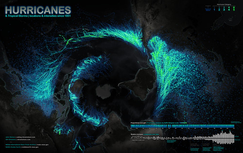
Want to see a map of every hurricane tracked since 1851? This is a really cool visualization of this data, though it may take a minute to orient yourself to the map projection:

Click to enlarge. Image copyright IDVsolutions .

Really, this should be called a cyclone map, because it includes all cyclonic storms: both tropical storms and hurricanes/typhoons/cyclones, depending on linguistic preferences. But it’s an American map, so the creator apparently chose to go with “hurricane.” A blog post in which the creator talks about making the map is here.

The brightness intensity of the Atlantic & E. Pacific storms seems enhanced compared to that of the W. Pacific and Indian Ocean storms. I suspect this is because tracking of these storms by NOAA (which is where the dataset comes from) started rather late. It’s a bit unfortunate, because one of the things people will do is compare the prevalence of cyclones in various regions, and the Philippine Sea, S. China Sea, and W. Pacific are very active regions for cyclones. So the overall effect is to give an unbalanced view of the activity in various regions. (Admittedly, I haven’t looked at the data myself, so my concern might be unfounded here.)

Still, a very interesting visualization!

Categories
environment information representation visuals

A century of overfishing, at a minimum

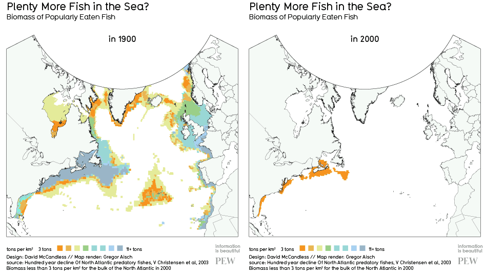
I ran across this animated GIF today, via Southern Fried Scientist, that vividly illustrates the effects of a century of overfishing on the biomass of fish in the North Atlantic. It’s a pretty stark visual depiction of changes that have happened to the oceans worldwide, in just the past century.

This image wascreated by Information is Beautiful‘s David McCandless from a PEW report on historic declines on several fish species. He posts about the image here, and includes a link to the cited report. In his post, McCandless points out that even by the 1900s, we had had a huge effect on the number of fish (and whales, and turtles, and seals, and sea cows, and so on…) in the sea. So one important thing to keep in mind for context is that the fish abundance from 1900 is not a “pre-human impact” point in time.

Categories
environment information representation visuals

Infographic: Benefits of buying locally

I just came across this infographic about the environmental and economic benefits of buying locally-produced products via Food and Tech Connect. The argument here is that we gain disproportionate environmental, economic, and social benefits from purchasing locally-sourced products (mainly food) or purchasing goods from locally-owned businesses, rather than purchasing goods produced far away or from large retail chains.

I don’t disagree with the general argument of the graphic, though I will point out that there are additional nuances to these issues that this graphic doesn’t explore. For example, the environmental costs of shipping produce a long distance via ship can be lower than shipping it a shorter distance via truck. But these types of arguments are notoriously difficult to make in a small space, and this graphic probably serves a purpose in getting people who are completely unaware of these issues to think about them.

I’m also not sure I like the top-down viewpoint and general “sprawl” of the graphic. Granted, it does a good job of conveying far-flung supply chains, but I’d probably want to create something a bit more compact. At any rate, it’s interesting to take a look at.

(Click to view larger original version at eLocal.com.)

Why Buy Local Infographic

Categories
birds information representation visuals

Visualization project post, part 2

Because this was a very preliminary study, I only had 9 participants, mainly fellow students in the T&T program (and a last-minute addition of some family members). My main goal was to see if this would actually work, and I wasn’t really expecting dramatic results. Which is what happened- generally, there weren’t significant differences in the maps that the interactive and non-interactive viewers drew. This probably happened because the description of how to read a phylogenetic tree was too thorough (which, unfortunately, I realized after the fact…). If I do something like this again, I’ll definitely make this orientation info less detailed.

Overall, there were big differences in how well people remembered the two big groups on the tree- land birds and shorebirds- shorebird families were apparently much more challenging to remember. This result was correlated with how well people reported that they know birds in general: more general bird knowledge was related to doing better at remembering the shorebird part of the tree. One thing I might do differently would be to give people a list of family names- that way, at least terminology wouldn’t be an issue.

Some open-ended questions that I asked gave me more useful ideas for designing a future study. For example, several people said that they learned that specific families were related, but wanted to see more information on either the names of the branch groupings, or the common ancestor of related species. This raises a few interesting points, because higher-order taxonomy is often different than genetic differences (so there aren’t necessarily names for branches), and ancestral species are really hypothetical last common ancestors, not known species. It would be interesting to think of ways to communicate this to people in a diagram like this.

So, the upshot is that this project gave me some new ideas about how to design a study like this, even though it didn’t give me very conclusive results. Obviously, just adding interactivity to a phylogenetic tree won’t magically make people learn it better- it would be surprising if it did.

I probably won’t be working in interactive phylogenetic trees for my dissertation- there are a number of people working on that at the moment, but I’m think of working on something related. I’m sure I’ll be talking more about that here as my ideas come into shape.

For those interested: here’s the list of references I used in this project:

  • Baum, David A., Stacey D. Smith, and Samuel S. S. Donovan. “The Tree-Thinking Challenge.” Science 301 (2005): 979-980. Web.
  • Baum, David A., and Susan Offner. “Phylogenies and Tree-Thinking.” The American Biology Teacher 70.4 (2008): 222-229. Web.
  • Carrizo, Savrina F. “Phylogenetic Trees: An Information Visualisation Perspective.” Yi-Ping Phoebe Chen, ed. Conferences in Research and Practice in Information Technology 29 (2004): 315-320. Web.
  • Cranfill, Ray, and Dick Moe. Deep Green-Hyperbolic Trees. Web. 20 September 2010.
  • Liu, Zhicheng, Nancy J. Nersessian, and John T. Stasko. “Distributed Cognition as a Theoretical Framework for Information Visualization.” IEEE Transactions on Visualization and Computer Graphics. 14.6 (2008): 1173-1180. Web.
  • Maddison, David A, Katja-Sabine Schulz, and Wayne P. Maddison. “The Tree of Life Web Project.” Linnaeus Tercentenary: Progress in Invertebrate Taxonomy. Ed. Z.-Q. Zhang and W. A. Shear. Zootaxa 1668 (2007): 1-766. Web.
  • Rogers, Yvonne, and Mike Scaife. “How Can Interactive Multimedia Facilitate Learning?” In J. Lee, ed. Intelligence and Multimodality in Multimedia Interfaces: Research and Applications. Menlo Park, CA: AAAI Press, 1998. Web.
  • Scaife, Mike, and Yvonne Rogers. “External cognition: how do graphical representations work?” International Journal of Human-Computer Studies 45 (1996): 185-213. Print.
  • Stenning, Keith, and Jon Oberlander. “A Cognitive Theory of Graphical and Linguistic Reasoning: Logic and Implementation.” Cognitive Science 19.1 (1995): 97-140. Web.
  • Tree of Life Web Project. Web. 19 September 2010.
  • Tversky, Barbara. “Cognitive Maps, Cognitive Collages, and Spatial Mental Models.” A. U. Frank and I. Campari, eds. Spatial Information Theory: A Theoretical Basis for GIS, Proceedings COSIT ’93. Berlin: Springer, 1993. Print.
  • Yi, Ji Soo, Youn ah Kang, John T. Stasko, and Julie A. Jacko. “Toward a Deeper Understanding of the Role of Interaction in Information Visualization.” IEEE Transactions on Visualization and Computer Graphics 13.6 (2007): 1224-1231. Print.
  • Zhang, Jiajie, and Donald. A. Norman. “Representations in Distributed Cognitive Tasks.” Cognitive Science 18.1 (1994): 87-122.
Categories
birds evolution information representation visuals

Visualization project post, part 1

This semester, I worked on a small science visualization research project, partly for a course, and partly as a pilot study related to my possible ultimate dissertation research. I’ll probably break up my discussion of this project into a few posts.

I was interested in looking at whether interactivity affects people’s understanding of phylogenetic trees. Phylogenetic trees are one of the key tools used in the field of evolutionary biology to represent hypothesized evolutionary relationships among species or other biological groups. They let us both explore relationships among living species and make inferences about the history of life.

However, interpreting tree diagrams often presents a challenge to students. On trees, the nodes (branch points) symbolize the last common ancestor between the species represented by the branch tips. Inexperienced readers tend to “read” relationships along branch tips, rather than by nodes, which can lead to misconceptions like inferring that species on the tips gave rise to other species (e.g., frogs to snakes to birds). The correct way to read phylogenies is to think of the nodes as focal points that connect related species.

One of the diagrams from the project introduction.

My experiment was designed to test whether making a phylogenetic tree diagram interactive, in such a way as to emphasize the importance of branch-point connections, would help people recall relationships more accurately when drawing the tree from memory. Cognitive theory suggests that interactive science visualizations could be useful for building understanding, because as we manipulate a visualization, we are able to generate slightly different viewpoints of it. We then put these points of view together into a mental model. A number of groups (e.g., here, here) have experimented with interactive trees, but in most of these projects, viewers interact with the tree by selecting branch tips in a higher-level tree, which takes them to a screen with a lower-level tree. With this type of navigation, the viewer effectively zooms in on a specific region of the tree, and the overall context for the tree is lost.

For this project, I created a tree of Florida bird families, based on the information on the Tree of Life website. To help people with unfamiliar families, there was a thumbnail photo of a representative species and a short fact about each family on the tree.

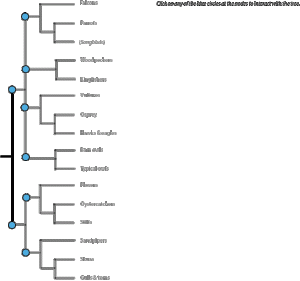
Viewers could click on a node to "open up" a branch.

Viewers were presented with a complete tree (so they didn’t lose the overview of the entire tree), and had the ability to select one node with its connected species to highlight at one time (thus maintaining the importance of reading by nodes).

Example of an "open" branch.
The overall non-interactive tree. All photos open-source from Wikipedia.

My experiment worked like this: 1) viewers read a description of how to read a phylogenetic tree, 2) they either interacted with a dynamic tree or viewed a static tree, 3) were asked to draw the tree from memory, and 4) answered some questions about themselves and the tree. They weren’t told ahead of time that they would have to draw the tree from memory. In my next post, I’ll talk about what actually happened…

Categories
discourse community/community of practice exam readings information representation visuals

Exam readings: diagrams as boundary objects

For today, two takes on the concept of “boundary objects:” concepts, texts, machines, diagrams, etc. that serve as meeting points between different social worlds.These focus on diagrams (natch): infrastructure schematics and Gantt charts.

Lucy Suchman. “Embodied Practices of Engineering Work.” Mind, Culture, and Activity 7(1&2): 4–18, 2000.

Summary: Uses ethnomethodology (EM) and activity theory (AT; doesn’t use the triangle) to describe design practices in civil engineering. Her focus is the use of CAD and paper diagrams in planning; these diagrams connect EM & AT. EM is phenomenological & descriptive of artifacts in use and work practices; it’s not used to build generalizable theory. AT focuses on how tools mediate and are in turn created by social work practices; it’s also ultimately not generalizable b/c of its focus on specific situations (framework, not theory). Her research comes from conversations with/tutorial of the process of designing a road by an engineer. The CAD display is complex: 2-D and 3-D views, puts plans onto 3-D topographical layer than lets engineers take viewing sections through it, and includes natural and built infrastructural features (old infrastructure, new project, and temporary elements needed to support construction). Engineers also use paper: maps (taking collective notes, getting sense of big picture) and notes. Two key practices bring together these elements: “professional vision” (mental simulation of the project site, as aided by the CAD tools), and embodiment of engineers (gestures, hand motions to indicate third dimension, etc.). Paper and CAD have different affordances, so engineers use both. Concludes by describing similarities/differences between EM and AT.

Comments: This paper touched on AT, but was not strictly an AT analysis (more an EM-based description). Point seems to have been to use her case study as a way to draw parallels between the two methodologies.

Links to: Roth (AT description); Sharples et al. (more standard? AT analysis)

Elaine K. Yakura. “Timelines as Temporal Boundary Objects.” The Academy of Management Journal. 45(5): 956-970, 2002.

Summary: Yakura looks at timelines (Gantt charts) in work environments as “temporal boundary objects:” they render time concrete and serve as points of synthesis and negotiation among different groups in a business (e.g., programmers, managers, clients). They also embody elements of narrative (beginning, middle, end) that helps people envision milestones as well as project completion. They are “monotemporal” (mechanistic & standardized view of time), in contrast to “pluritemporal” (multiple cultural/occupational groups mark time with different activities), and serve as sites of negotiation and translation among different groups. Three functions of timelines are for scheduling, synchronization, and time allocation for various tasks; these categories are not interpreted the same by all groups involved in a project, so the timeline is a site of discussion. Presents a case study of timeline use, discussion, and renegotiation (as unforeseen events required updating it); the case study illustrates pluritemporalism & use as a boundary object.

Comments: Example of a visualization as a boundary object between different groups. Timelines aren’t intended as permanent artifacts, but Yakura points out that they’re treated as reality even while undergoing revision; they also symbolize a tangible work product between milestones/when tasks are in process.

Links to: Suchman (paper maps as boundary objects in engineering)

Categories
exam readings information representation visuals

Exam reading: “Visual explanations”

This second book by Tufte is probably more applicable to the narrative study of images (though now I’m wishing I’d put “Understanding Comics” on my reading list).

Edward Tufte. Visual Explanations: Images and Quantities, Evidence and Narrative. Cheshire, CT: Graphics Press, 1997.

Summary: This book focuses on strategies for presenting information about change: motion, process, cause/effect. Quantities can be represented by labels, encodings (e.g., color-coding), and self-representing scales (e.g., penny in a photo); maps do this by location on grid & size of marker. Creators should place data in appropriate context to assess cause/effect, make quant. comparisons, consider alternative explanations, and assess potential errors in numbers. “Numbers become evidence by being in relation to” other numbers, objects, etc. change can be inferred from multiple, layered views (incorporates parallelism of space or time, lets viewer make comparisons). Discusses principle of “smallest effective difference”- make all distinctions as subtle as possible, but still visible. Also “disinformation design:” suppressing content and preventing reflective analysis by “visual masking” of important features with unimportant ones (e.g., cigarette warning labels). This is not necessarily intentional: can occur through faulty parallelism, trying to emphasize everything, or false clusters created by proximity. Ends by discussing complex narrative forms of data display, or “confections.” These juxtapose tangentially related visual elements in collage fashion; he emphasizes that a purposeful arrangement of these renders them meaningful (in contrast to just slapping them together because).

Comments: Tufte discuses magic diagrams as ways to show action sequences and time; comics do similar things. He briefly discusses the design of customizable computer interfaces as an example of visual narrative (one example used is dynamic museum guides). He applies his standard design ideas (high information-rich content, make clear & sufficient computer commands visible)- I wonder if that last suggestion will change as more people get used to usingapps on wireless devices with few controls?

Links to: Kostelnick & Hassett (discuss the social context of design, rather than design principles); Nersessian, Gilbert (cognition & visuals)

Categories
exam readings information representation transparency visuals

Exam reading: “Visual display of quantitative info”

For a “traditional” (i.e., not community- or critical theory-based) approach to design of graphics, I’m including two books by Edward Tufte on my reading list. There’s a certain set of information visualization people that love his work, but a set of critical theorists and rhetoricians that regards it as arhetorical and emphasizing words (and data) over visual elements. Anyway, here’s the first book on my list:

Edward Tufte. The Visual Display of Quantitative Information, 2nd ed. Cheshire, CT: Graphics Press, 2001.

Summary: Tufte views infographics as “paragraphs about data;” however, design is universal- like mathematics rather than language. Graphics reveal data at several levels (overview to fine-grained), should be transparent, avoid distorting data, be information-dense, encourage comparisons, and be closely integrated with text, statistics, and datasets. Tufte briefly discusses the history and various types of graphics (data maps, time-series, “space-time narrative,” & relational graphics). Has chapters dedicated to graphical integrity (e.g., avoid distortions of area or scale, provide context), “data-ink” ratio=”data-ink”/total ink used to print graphic (higher better) and “chartjunk”-decorative features that don’t add interpretive info. Graphical elements should serve >1 function (e.g., position, size, color, and shape of data points can all reveal different dimensions). Also discusses data density= number of entries in data matrix/area of data graphic – idea is to try to maximize data density (maps as example of type with high data density); graphics can be smaller than we may think. Likes “small multiples”: multiple small graphics with the same format, but providing comparisons bet. changing variables (likens these to movie frames). Graphical elegance=simple design + complex data. Discusses appropriate uses of words to tables to graphics.

Comments: Outlines several reasons for continued problems with graphics: lack of quantitative training for artists, idea that statistical data are boring, idea that graphics are unsophisticated. Ideas that graphics should be transparent and conventions are universal don’t fit with rhetoric of design (though does recognize deliberate “distortion” of data as rhetorical decision). He gives several ideas for simplifying/modifying current forms; assumes people will accept these if they see them enough (resistence to new formats can be easily overcome by designers).

Links to: Kostelnick & Hassett (rhetorical design); Tversky (different emphasis on maps as data viz)