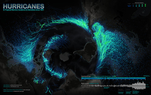
This is timely, since Florida’s first cyclone threat of 2012 is churning toward us in the Caribbean.
Want to see a map of every hurricane tracked since 1851? This is a really cool visualization of this data, though it may take a minute to orient yourself to the map projection:

Really, this should be called a cyclone map, because it includes all cyclonic storms: both tropical storms and hurricanes/typhoons/cyclones, depending on linguistic preferences. But it’s an American map, so the creator apparently chose to go with “hurricane.” A blog post in which the creator talks about making the map is here.
The brightness intensity of the Atlantic & E. Pacific storms seems enhanced compared to that of the W. Pacific and Indian Ocean storms. I suspect this is because tracking of these storms by NOAA (which is where the dataset comes from) started rather late. It’s a bit unfortunate, because one of the things people will do is compare the prevalence of cyclones in various regions, and the Philippine Sea, S. China Sea, and W. Pacific are very active regions for cyclones. So the overall effect is to give an unbalanced view of the activity in various regions. (Admittedly, I haven’t looked at the data myself, so my concern might be unfounded here.)
Still, a very interesting visualization!