This semester, I worked on a small science visualization research project, partly for a course, and partly as a pilot study related to my possible ultimate dissertation research. I’ll probably break up my discussion of this project into a few posts.
I was interested in looking at whether interactivity affects people’s understanding of phylogenetic trees. Phylogenetic trees are one of the key tools used in the field of evolutionary biology to represent hypothesized evolutionary relationships among species or other biological groups. They let us both explore relationships among living species and make inferences about the history of life.
However, interpreting tree diagrams often presents a challenge to students. On trees, the nodes (branch points) symbolize the last common ancestor between the species represented by the branch tips. Inexperienced readers tend to “read” relationships along branch tips, rather than by nodes, which can lead to misconceptions like inferring that species on the tips gave rise to other species (e.g., frogs to snakes to birds). The correct way to read phylogenies is to think of the nodes as focal points that connect related species.

My experiment was designed to test whether making a phylogenetic tree diagram interactive, in such a way as to emphasize the importance of branch-point connections, would help people recall relationships more accurately when drawing the tree from memory. Cognitive theory suggests that interactive science visualizations could be useful for building understanding, because as we manipulate a visualization, we are able to generate slightly different viewpoints of it. We then put these points of view together into a mental model. A number of groups (e.g., here, here) have experimented with interactive trees, but in most of these projects, viewers interact with the tree by selecting branch tips in a higher-level tree, which takes them to a screen with a lower-level tree. With this type of navigation, the viewer effectively zooms in on a specific region of the tree, and the overall context for the tree is lost.
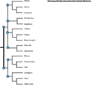
For this project, I created a tree of Florida bird families, based on the information on the Tree of Life website. To help people with unfamiliar families, there was a thumbnail photo of a representative species and a short fact about each family on the tree.

Viewers were presented with a complete tree (so they didn’t lose the overview of the entire tree), and had the ability to select one node with its connected species to highlight at one time (thus maintaining the importance of reading by nodes).


My experiment worked like this: 1) viewers read a description of how to read a phylogenetic tree, 2) they either interacted with a dynamic tree or viewed a static tree, 3) were asked to draw the tree from memory, and 4) answered some questions about themselves and the tree. They weren’t told ahead of time that they would have to draw the tree from memory. In my next post, I’ll talk about what actually happened…