Categories
maps science communication

En route to AGU

My recent blog silence has been partially because I’ve been getting ready to present research at the 2103 American Geophysical Union (AGU) Fall Meeting. I’ve been working on a comparative analysis of online interactive sea level rise viewers, which are used to help people visualize the potential effects of sea level rise on coastlines. I’ll be presenting some of the results at the conference as a poster presentation on Monday afternoon, titled “Building Stories about Sea Level Rise through Interactive Visualizations” (Paper Number PA13A-1762, for anyone who sees this and is interested in talking to me :))

Here’s the introduction:

Sea level rise (SLR) is an aspect of global climate change that can be communicated effectively using visuals. We focus on online interactive SLR viewers, which: visualize SLR or coastal areas that could potentially be affected by SLR; allow users to interact with the visualization by scrolling, zooming, and other features related to view selection; use a map as a base layer; and are located online. SLR viewers can visualize a range of SLR scenarios to communicate about possible coastal impacts. They let us represent the effects and risks of SLR for coastal planning and community outreach. As users interact with SLR viewers, they build personalized narratives about SLR’s effects and risks. By helping audiences visualize the potential impacts of SLR in locations that are personally important to them, we can motivate them to try to understand SLR and support efforts to mitigate or respond to it.

And here’s a pdf version of it:  Stephens AGU poster. Please note the screenshots in the poster are copyrighted by their respective creators. I’ve also collaborated on two other presentations related to science communication in general:

D. E. DeLorme, S. C. Hagen, & S. H. Stephens, 2013. “Strategies for Sharing Scientific Research on Sea Level Rise: Suggestions from Stakeholder Focus Groups.”

S. C. Hagen, S. H. Stephens, D. E. DeLorme, D. Ruple, & L. Graham, 2013. “Increasing Public Access to Scientific Research through Stakeholder Involvement: Ecological Effects of Sea Level Rise in the Northern Gulf of Mexico.”

I’ve never been to an AGU meeting before, and from what I hear, it can be an overwhelming experience (>20,000 people attending!). But I’m armed with a list of interesting presentations that I want to see and am meeting up with some folks there, so it should be interesting. Of course, I’m also hoping to get some birding in while I’m there- at least see the famous San Francisco parrots!
Categories
information representation maps science communication

Upcoming presentations

I’ve recently had a proposal accepted to present some research at the upcoming American Geophysical Union conference. I have to say that I never really pictured myself presenting at an AGU meeting, what with not being a geologist and all 🙂 But since I’m working on the communication of sea level rise, it’s actually a good fit for this project. At any rate, I think it’ll be an interesting presentation. Here’s the abstract; my coauthors are Denise DeLorme (UCF-Communication) and Scott Hagen (UCF-Civil, Envtl. & Construction Engineering):

Building Stories about Sea Level Rise through Interactive Visualizations
Digital media provide storytellers with dynamic new tools for communicating about scientific issues via interactive narrative visualizations. While traditional storytelling uses plot, characterization, and point of view to engage audiences with underlying themes and messages, interactive visualizations can be described as “narrative builders” that promote insight through the process of discovery (Dove, G. & Jones, S. 2012, Proc. IHCI 2012). Narrative visualizations are used in online journalism to tell complex stories that allow readers to select aspects of datasets to explore and construct alternative interpretations of information (Segel, E. & Heer, J. 2010, IEEE Trans. Vis. Comp. Graph.16, 1139), thus enabling them to participate in the story-building process. Nevertheless, narrative visualizations also incorporate author-selected narrative elements that help guide and constrain the overall themes and messaging of the visualization (Hullman, J. & Diakopoulos, N. 2011, IEEE Trans. Vis. Comp. Graph. 17, 2231).
One specific type of interactive narrative visualization that is used for science communication is the sea level rise (SLR) viewer. SLR viewers generally consist of a base map, upon which projections of sea level rise scenarios can be layered, and various controls for changing the viewpoint and scenario parameters. They are used to communicate the results of scientific modeling and help readers visualize the potential impacts of SLR on the coastal zone. Readers can use SLR viewers to construct personal narratives of the effects of SLR under different scenarios in locations that are important to them, thus extending the potential reach and impact of scientific research. With careful selection of narrative elements that guide reader interpretation, the communicative aspects of these visualizations may be made more effective.
This presentation reports the results of a content analysis of a subset of existing SLR viewers selected in order to comprehensively identify and characterize the narrative elements that contribute to this storytelling medium. The results describe four layers of narrative elements in these viewers: data, visual representations, annotations, and interactivity; and explain the ways in which these elements are used to communicate about SLR. Most existing SLR viewers have been designed with attention to technical usability; however, careful design of narrative elements could increase their overall effectiveness as story-building tools. The analysis concludes with recommendations for narrative elements that should be considered when designing new SLR viewers, and offers suggestions for integrating these components to balance author-driven and reader-driven design features for more effective messaging.

I’ll also be presenting a poster at the upcoming Sea Level Rise Summit, related to a major research project that the CHAMPS Lab is currently involved in. My coauthors are Scott Hagen and the EESLR-NGOM team. My role here will be to describe the unique aspects of this project, which I’ve recently become involved in:

The Coastal Dynamics of Sea Level Rise: A Case Study Approach
This presentation describes the Ecological Effects of Sea Level Rise-Northern Gulf of Mexico (EESLR-NGOM) project, an integrated field observation and modeling study that will predict how sea level rise (SLR) interacts with coastal hydrology to affect different marsh and coastal species. This multidisciplinary project builds on lab and field experiments and observations to inform a suite of predictive computer models. The project combines models of water circulation, overland flow, coastal hydrodynamics, and sediment transport. Models and ground-based assessments will provide forecasts of intertidal marsh evolution and inform marsh, seagrass, and oyster habitat models. The ultimate predictions will include the impact of SLR on intertidal marshes, oysters, and submerged aquatic vegetation at the three National Estuarine Research Reserves (NERRs). Science team members are working with coastal resource managers to ensure that project results and decision support tool products are useful to them. Partners include: Univ. of Central Florida; Florida State Univ.; Univ. of South Carolina; Apalachicola, Grand Bay and Weeks Bay NERRs; and Dewberry.

Categories
environment information representation maps visuals

Want to see a map of every cyclone since 1851?

This is timely, since Florida’s first cyclone threat of 2012 is churning toward us in the Caribbean.

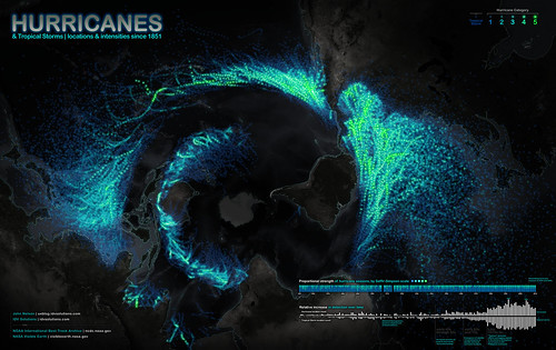
Want to see a map of every hurricane tracked since 1851? This is a really cool visualization of this data, though it may take a minute to orient yourself to the map projection:

Click to enlarge. Image copyright IDVsolutions .

Really, this should be called a cyclone map, because it includes all cyclonic storms: both tropical storms and hurricanes/typhoons/cyclones, depending on linguistic preferences. But it’s an American map, so the creator apparently chose to go with “hurricane.” A blog post in which the creator talks about making the map is here.

The brightness intensity of the Atlantic & E. Pacific storms seems enhanced compared to that of the W. Pacific and Indian Ocean storms. I suspect this is because tracking of these storms by NOAA (which is where the dataset comes from) started rather late. It’s a bit unfortunate, because one of the things people will do is compare the prevalence of cyclones in various regions, and the Philippine Sea, S. China Sea, and W. Pacific are very active regions for cyclones. So the overall effect is to give an unbalanced view of the activity in various regions. (Admittedly, I haven’t looked at the data myself, so my concern might be unfounded here.)

Still, a very interesting visualization!

Categories
Japan maps travel

Kinkaku-ji

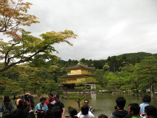
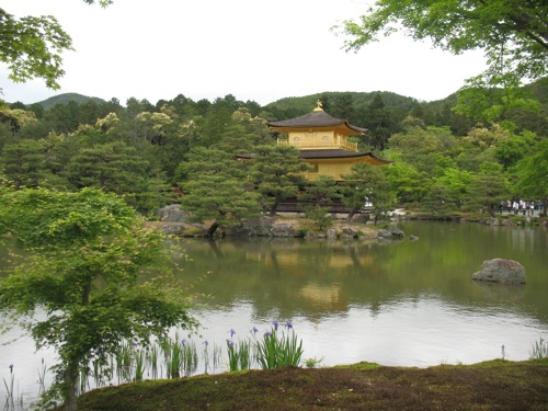
Kinkaku-ji, located in the northwestern part of Kyoto, is one of the most famous temples in the city. It’s also one of the most clearly recognizable sights, being covered in gold leaf.

View of the pavilion from across the pond. (Photo: Y. Fernandez)

The Golden Pavilion (the translation of its name) is actually only one part of the temple complex, but it was definitely the main attraction on our- and apparently everyone else’s- visit. As with most of the sights, there were certain viewing locations that were a magnet for photographers; other locations were passed on by.

People were pretty good about making way for others who wanted to take photos with themselves and the pavilion in the background. (Photo: Y. Fernandez)

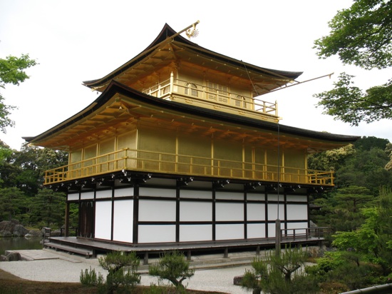
In contrast to Ginkaku-ji, Kinkaku-ji was actually bigger than I expected it to be. I was really not expecting a building covered in gold to be very large. I know I keep emphasizing the gold bit here, but it really was … shiny.

A closer view of the pavilion.

As with any important site in Kyoto, there were fairly large crowds. We’d read about something that happens occasionally at these sights that actually did happen here- apparently, English-language teachers will sometimes take small groups of schoolchildren to tourist sights to practice on them. This happened to me here, but not to Yan (perhaps the beard made him too intimidating or something). So I answered some standard questions (“What is your name?” “Where are you from?” “What is your favorite Japanese food?”), and was photographed with the girl asking them. It was kind of cute.

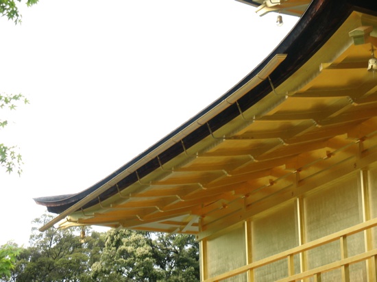
Even the gutters were coated in gold! (Photo: Y. Fernandez)

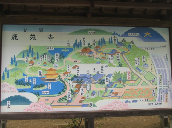
So back to the pavilion. Apparently, it was built by a shogun in the late 14th century/early 15th century, and turned into a Zen Buddhist temple after the shogun’s death. The original structure was destroyed by arson in 1950, so the present version is a replica. Gold has symbolic properties of purification. The pavilion is part of a garden complex that includes some very pretty landscaping, a few small shrines, and some larger buildings- a teahouse, several temple buildings, and (of course) several stands that sell charms, candles, and souvenirs. The complex as a whole is easily accessed by bus.

Map of the temple grounds and garden. (Photo: Y. Fernandez)

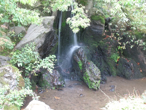
As with many of the gardens we visited, water was an important feature. In this garden, there were little streams and a few little waterfalls. This one had a feature called “carp rock,” because the large stone supposedly looks like a leaping fish.

Carp rock.

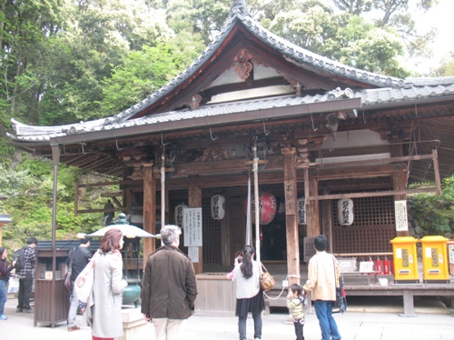
At the temple building where one leaves offerings, we lit a candle for family health. We also bought a few souvenirs: some postcards (which were surprisingly hard to find elsewhere), a charm, and some green tea mochi on a stick. Yum.

This was one of the “working” temple buildings. The racks for candles are on the left side.

So this was definitely a cool sight to see. There was a nice garden to wander through, yummy snacks, and assorted souvenirs that ranged from sacred (charms for safe driving, good grades, family health, etc.) to …less so (Hello Kitty banners with Kinkaku-ji in the background).

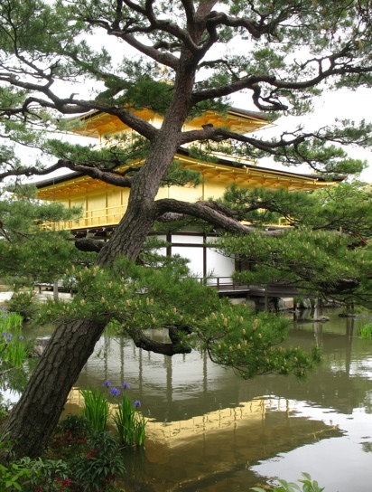
The pavilion from the back. I really like this photo.